Calendar View
The Calendar tab is the main scheduling interface for viewing and interacting with your events. It supports multiple view modes, a customizable toolbar, and a range of visual options.
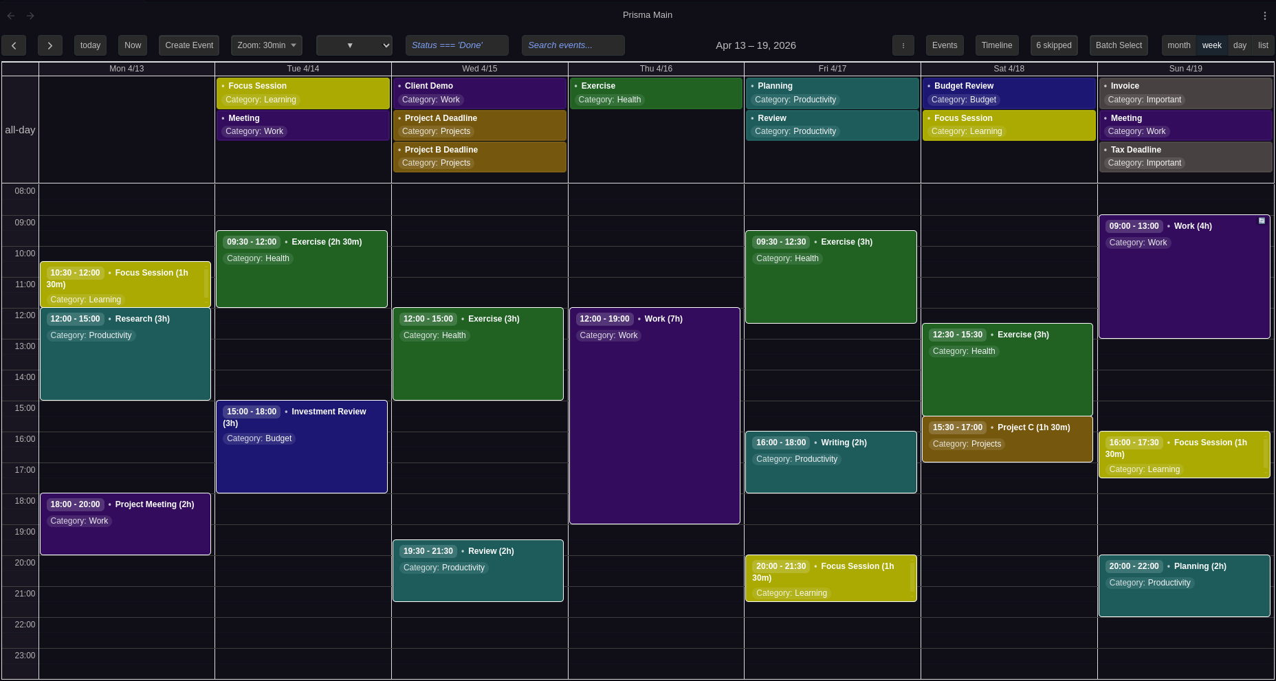
View Modes
Prisma Calendar offers five view modes, switchable from the toolbar:
| View | Description |
|---|---|
Year (multiMonthYear) | Twelve months laid out in a compact grid. Events appear as compact chips with automatic "+more" overflow, color dots show event colors at the top of each day, and the palette matches your Obsidian theme. Click an event to open it, click a day to create one. Prev/Next step a year at a time. |
Month (dayGridMonth) | Full month grid with event chips. Color dots indicate events on each day. |
Week (timeGridWeek) | Seven-day time grid with hourly slots. Events display at their exact times. |
Day (timeGridDay) | Single-day time grid for detailed scheduling. |
List (listWeek) | Flat list of events for the current week, sorted chronologically. |
Configure the default view in Settings → Calendar → View Configuration → Default view.
Mobile View
Mobile devices (screen width ≤ 768px) can use a different default view, optimized for smaller screens. Configure in Settings → Calendar → View Configuration → Default mobile view.
Toolbar
The toolbar sits at the top of the calendar and provides quick access to navigation, event creation, filtering, and display controls. Each button can be individually shown or hidden in Settings → Configuration → Toolbar Buttons.
Navigation Buttons
| Button | Action |
|---|---|
| Left (◀) | Navigate to the previous period (previous year, month, week, or day depending on current view) |
| Right (▶) | Navigate to the next period |
| Today | Jump to today's date |
| Now | Scroll to the current time in day and week views. In year and month views, scrolls to today's cell. Not available in list view. |
| Title (e.g. "October 2026") | Click to open the Go to date picker — see below |
Go to Date
To jump straight to a date instead of stepping there with the arrows, click the toolbar title or run the Go to date command (bind it to a hotkey in Settings → Hotkeys). A small picker opens, prefilled with the date you're currently on — pick a day and press Enter.
The jump keeps whatever view you're in: from Week view you land on the target date's week, from Month view on its month, from Day view on that day. Navigate back returns you to where you were, so checking what's already planned around a future date and coming back is two keystrokes.
Event Creation
| Button | Action |
|---|---|
| Create Event | Opens the Create Event modal. You can also create events by clicking or dragging on empty calendar space. |
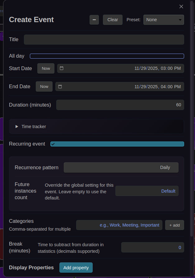
The Create Event and Edit Event modals include a Note content field for the Markdown body of file-backed events. It supports agendas, meeting notes, links, and other note text. While the modal is open, the field listens for changes to its backing note: an untouched field updates automatically; after you type, Prisma retains your draft and surfaces a conflict notice if the file changes. Saving a conflict asks before replacing the note body. The content field expands to fit its text without an inner scrollbar; the modal retains its usual height and scrolls its event fields. The event header, Title field, and divider remain visible while scrolling; select the header's down-arrow button, or press Ctrl/Cmd+Shift+N, to scroll to and focus the content field. The up-arrow beside Cancel returns to event details. Virtual events do not include the field because they have no backing note.
Zoom Level
| Button | Action |
|---|---|
| Zoom Level | Displays the current time slot duration (e.g., "10m"). Click to cycle through zoom levels, or use CTRL+scroll to zoom in and out. |
Zoom controls the granularity of time slots in day and week views. The default zoom levels are 1, 2, 3, 5, 10, 15, 20, 30, 45, 60 minutes, configurable in Settings → Calendar → Time Display → Zoom levels. The viewport stays centered on the same time when zooming.
Filtering
| Button | Action |
|---|---|
| Search Input | Text field for filtering events by title. Case-insensitive. Press Enter or blur to apply. |
| Expression Filter | Text field for property-based filtering using JavaScript expressions (e.g., Status !== 'Done'). |
| Filter Presets (▼) | Dropdown to apply saved filter expressions with one click. Select "Clear" to remove the active filter. |
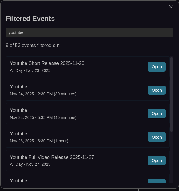
See Filtering for full documentation on search, expressions, and presets.
Other Toolbar Buttons
| Button | Action |
|---|---|
| Untracked Events | Opens a dropdown showing events without date properties. See Untracked Events. |
Untracked Events Menu
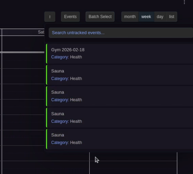
Reopen the calendar view for toolbar changes to take effect.
Time Display
Configure the visible time range and slot behavior in Settings → Calendar → Time Display:
- Day start / end hour: Visible time range in day and week grids (default: 7:00–23:00)
- Slot duration (minutes): Height of each grid slot (default: 30 minutes, range: 1–60)
- Snap duration (minutes): Drag and resize snapping interval (default: 30 minutes, range: 1–60)
- Zoom levels (minutes): Comma-separated list for CTRL+scroll zoom (default:
1, 2, 3, 5, 10, 15, 20, 30, 45, 60)
Visual Appearance
Display Density
Two density modes control event spacing:
- Comfortable (default): Standard spacing between events
- Compact: Reduced spacing for more events on screen
Configure in Settings → Calendar → Visual Appearance → Display density.
Event Text Coloring
The calendar automatically adjusts event text color based on the event's background color for readability:
- Default event text color: Preferred text color (default: white)
- Alternative event text color: Fallback used when the default isn't readable enough on the event's background (default: black)
The detection is automatic — the calendar measures the default color's WCAG contrast ratio against the event's background and switches to the alternative only when it falls below a readability floor. Text contrast sensitivity sets that floor on a nine-step ladder, so you can dial in exactly how eagerly the alternative kicks in:
- Always primary color: never switch — your default color everywhere.
- Minimal (1.5:1) through Balanced (4.5:1): the floor rises in half-steps (1.5, 2, 2.5, 3, 3.5, 4, 4.5). Lower floors keep your default color on more backgrounds — e.g. a bright green (≈2.8:1 for white text) keeps white text at the default Moderate (2.5:1) but switches at Prefer primary (3:1). 4.5:1 is the WCAG AA level for normal text.
- Maximum contrast: always use whichever of the two colors contrasts more with the background.
Configure all three settings in Settings → Calendar → Visual Appearance.
Other Visual Options
- All-day event columns: In the daily view, multiple all-day events sit side by side when there is enough horizontal space, with width proportional to content. Events wrap to new rows when they don't fit
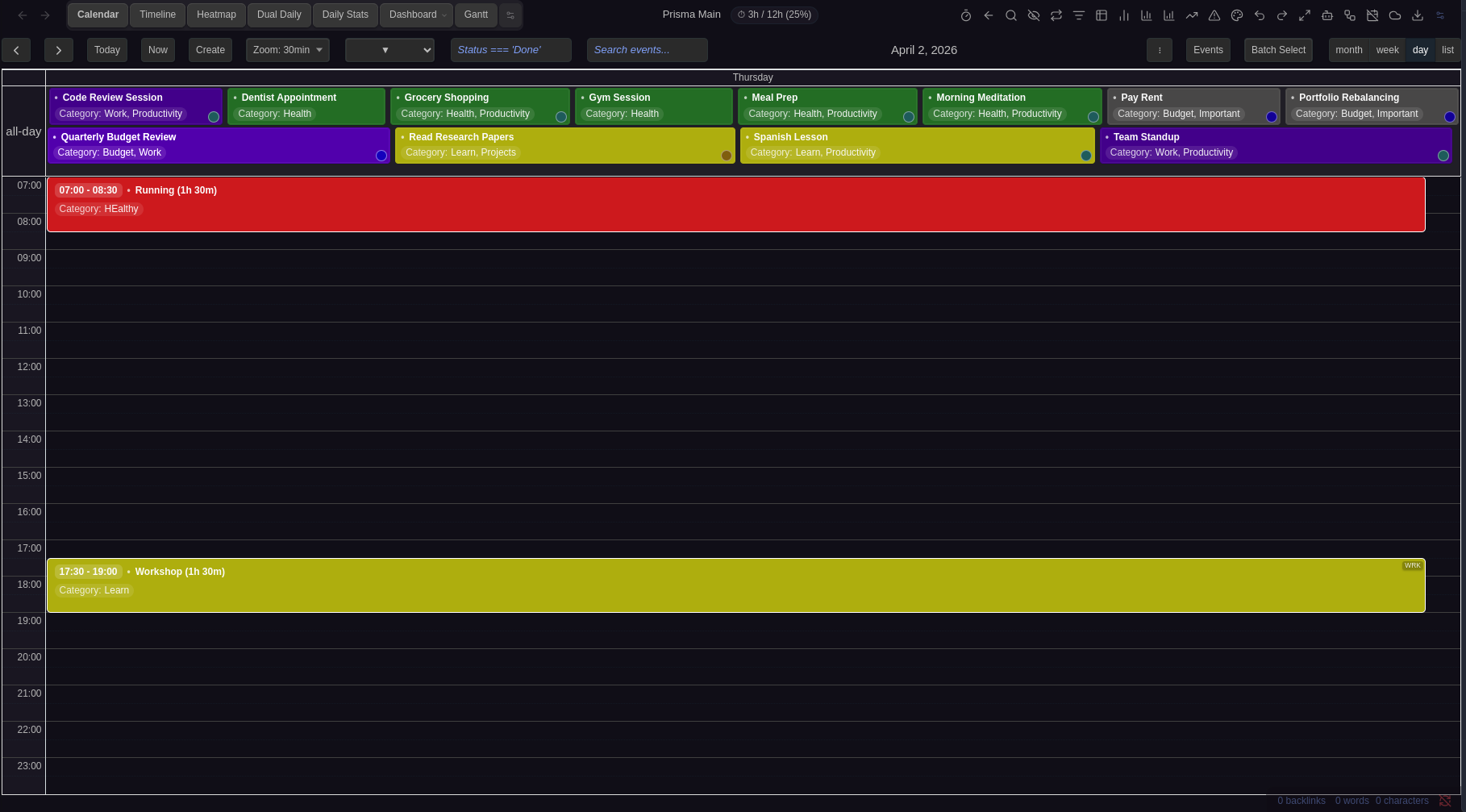
- All-day event height: Maximum pixel height for all-day events before they scroll internally (30–500px, default: 75px)
- Past event contrast: Dims past events (0% = invisible, 100% = normal, default: 70%)
- Show color dots: Color indicator dots in month and year view cells (enabled by default)
- Thicker hour lines: Bolder full-hour dividers in day/week views (enabled by default)
- Show duration in event title: Appends duration in parentheses after the title for timed events, e.g., "Meeting (2h 30m)" (enabled by default)
- Show decimal hours: Displays durations as decimal hours (e.g., 2.5h) instead of formatted (e.g., 2h 30m)
- Day cell coloring: Configurable gradient background for day cells, with optional month boundary mode. See Day Cell Coloring below.
Day Cell Coloring
The Day cell coloring dropdown controls the background coloring of day cells in the calendar. There are three modes:
Off (default)
No custom background is applied to day cells. The calendar uses its default appearance.
Uniform
All day cells receive a single gradient background using the Day background color picker that appears below the dropdown. This gives the entire calendar a consistent tinted look. Pick any color — the calendar applies it as a subtle gradient overlay on every cell.
Month boundary
Day cells alternate between two gradient colors based on their month, using the Even month color and Odd month color pickers that appear below the dropdown:
- Even month color — applied to January, March, May, July, September, November
- Odd month color — applied to February, April, June, August, October, December
Since adjacent months always have different parity, this creates a clear visual boundary wherever one month ends and the next begins — useful in week views that span two months or in month views that show overflow days from neighboring months.
Behavior details
- Colors are applied as gradient overlays, so they blend naturally with your theme's background.
- Today highlighting and hover states are preserved and take priority over the coloring.
- Out-of-month overflow days (the faded days in month view) use a slightly stronger tint for additional contrast.
- Changes take effect immediately — no need to reopen the calendar.
Configure in Settings → Calendar → Visual Appearance → Day cell coloring.
Sticky Headers
Sticky headers keep context visible while scrolling in day and week views:
- Sticky day headers: Pins the day/date column headers at the top of the viewport
- Sticky all-day events: Pins the all-day event section below the day headers (or at the top if day headers are not sticky)
When both are enabled, the all-day section sticks directly below the day headers with no gap.
These options only affect day and week views where vertical scrolling occurs. Month and list views are not affected.
Configure in Settings → Calendar → Visual Appearance.
Event Interaction
- Enable event preview: Hover previews inside the calendar (enabled by default)
- Event hover tooltips: Displays event name with time/duration, file path, frontmatter properties, and the first three lines of note content
- Show current time indicator: Red time line in day/week views (enabled by default)
- Highlight upcoming event: Highlights the next upcoming event (enabled by default)
- Skip underscore properties: Hides properties starting with
_from event chips (enabled by default)
Configure in Settings → Calendar → Event Interaction.
Removing stale events
If an event's underlying note is deleted or moved outside the calendar, the event can briefly linger on the grid with nothing behind it. Clicking, right-clicking, or dragging such a stale event removes it from the calendar — instead of failing to open or edit a file that no longer exists.
Scrolling while dragging
In day and week views, hold a dragged event near an edge of the grid and the calendar follows along so you can drop it somewhere that's currently off-screen:
- Left or right edge — pages to the previous or next period, so you can move an event to another week or day without letting go.
- Top or bottom edge — when you're zoomed in far enough that the whole day doesn't fit, the grid scrolls slowly up or down so you can drop the event on an earlier or later time. Rest the event against the edge to keep scrolling; move back toward the middle to stop.
The pause before paging at the left/right edge is the Drag edge scroll delay setting; vertical scrolling starts as soon as you reach the top or bottom edge.
Drops stay precise across a page: after the calendar pages to another week, the event lands on the slot under your cursor and keeps its duration — even when the destination week shows a different number of all-day events. All-day events can be dropped anywhere within a day's all-day strip, not just at its top edge, and the strip always keeps a comfortable minimum height so it's an easy target. While you're dragging, the all-day strip holds a steady height and renders it as normal day cells — no gap or empty band appears when the destination week has fewer all-day events — and the event you're holding stays visible under the cursor everywhere, including over the strip.
Event Overlap
Control how events display when they share the same time:
- Allow event overlap: allow events with overlapping times to render on top of each other. When disabled, overlapping events render side-by-side in columns (like Google Calendar). Applies to all calendar views (default: enabled)
- Allow slot event overlap: in week/day time-grid views, allow events that share the exact same time-slot boundaries to render on top of each other. When disabled, events with identical start/end times are placed in separate columns within the slot. Has no effect when event overlap is disabled (default: enabled)
- Event stack limit: Maximum events to stack before showing "+more" link (1–10, default: 1)
- Desktop max events per day: Maximum events per day on desktop before "+more" (0–10, 0 = unlimited, default: 0)
- Mobile max events per day: Maximum events per day on mobile before "+more" (0–10, default: 4)
Configure in Settings → Calendar → Event Overlap.
Day Overflow Popover
When a day holds more events than its cell can show, the cell ends with a +N more link. Clicking it opens a popover listing every event on that day — each with its time, title and property pills, one per row.
The popover is as tall as the screen allows: it starts at the day cell and extends to roughly 30px above the bottom of the window, scrolling inside when the day has more events than fit. If the day sits low on the screen, the popover moves up so it still gets a usable height. Click an event to open it, or close the popover with the ✕, Esc, or a click outside.
Year view always shows a +N more link on busy days — its month cells are too small to list events in full. In Month view the link appears once Desktop max events per day (or Mobile max events per day) is set above zero.
Hide Weekends
Toggle Saturday and Sunday visibility in Settings → Calendar → View Configuration → Hide weekends.
First Day of Week
Set which day starts the week (0 = Sunday, 1 = Monday, etc.) in Settings → Calendar → View Configuration → First day of week.
Indexing Indicator
When you open the calendar, Prisma scans your vault to build its event index. While that scan runs, a spinner appears centered over the grid so it's clear the calendar is still loading rather than empty. The overlay clears automatically the moment indexing finishes.
The same overlay reappears (labelled Re-indexing calendar events…) if Prisma needs to rebuild the index later — for example after a bulk change to your vault.
Mobile layout
On a phone — or any pane narrower than 768px — the calendar adapts so every view stays usable:
- The view tabs wrap onto multiple rows instead of running off the right edge, so every tab (including Dual Daily and Dashboard) stays visible and tappable.
- View toolbars wrap instead of clipping. On Timeline, Heatmap, and Gantt the filter controls and the Search events… box move onto their own row rather than being cut off the right edge, so the search stays reachable.
- The view-header actions trim to fit. The header shows only as many action buttons as fit the available width and always keeps the Manage button reachable, instead of letting the buttons overflow off the edge. The hidden ones stay one tap away in the action manager. This applies on desktop too — a narrow pane shows fewer buttons.
- Split views stack vertically and scroll. Dual Daily, Daily + Stats, Monthly + Stats, and the Dashboard show their panels in a single full-width column you scroll through, and each panel scrolls to reveal its full distribution chart instead of cropping the bottom. The chart's legend is hidden at phone width so the pie itself stays visible — the figures remain in the table below it and in each slice's tooltip.
- The yearly heatmap scrolls sideways. The full 12-month grid keeps its size and starts at January; swipe horizontally to reach the later months.
- Settings and the event modal reflow to fit. The color-rule, filter-preset, and category editors in Settings stack onto two rows at narrow width — the expression / name field on top, the color and controls below — so the inputs are wide enough to type in. The Create / Edit Event modal centers its title with the Virtual toggle inline, keeps each checkbox and toggle on one line with its label, and keeps the date picker readable next to compact Now / Fill buttons.
- Drag-to-edge paging works with touch. While dragging an event, holding it near the left or right edge pages the calendar — on touch now, not just with a mouse.
This is driven by the available width, so a narrow side-dock pane on desktop gets the same treatment. Pair it with a Default mobile view to land on the most useful view when you open the calendar on a phone.
See Also
- Configuration for the full settings reference
- Filtering for search, expression filters, and filter presets
- Color Rules for event background coloring
- Hotkeys for keyboard shortcuts in the calendar view
- Batch Operations for multi-select mode